Principal Component Analysis (PCA) is an algorithm that I first learnt in a pattern recognition class in college. I understood the motivation and how to use it, but never really understood why we do what we do in PCA.
We compute some big matrix then do singular value decomposition on it and then filter out some of the components. Why? What does that actually mean? What are we doing to the data? but again life moves on. I just put it in my bag of tools for ML and moved on.
Then in my first job at Mu Sigma Labs, I had to give a talk on things we were using for the project. I had the task of explaining PCA, Time Series Analysis and some other things. This article is a bit more refined version of that talk. The original presentation is here.
How many things is this data really measuring?
Most datasets have more columns than they have independent information. Take a set of body measurements: neck size, shoulder width, arm length. They look like three separate features, but they’re really all measuring the same thing, body size. Or even simpler, height in centimeters and height in inches. Two columns, one actual thing.
What PCA does is figure out how many actually independent things a dataset has, and what they are. Once we know that, we can drop the redundant columns. The data becomes easier to model, plot, etc., without losing much information.
Let’s build up to it. Start with the simplest case.
Take a column of body temperatures. Every row is around 36 or 37, maybe 38 or 39 if someone has a fever. Take away 37 from every value, and the differences between rows become much clearer.
The only informative part are the changes on top: 36.8, 37.4, 38.9. The rest is constant, and constants have no information (in a given dataset).
So that’s the core idea of PCA. What’s shared across rows isn’t information; only what varies is. The first step on any dataset is to subtract out what’s shared and keep what varies.
But “what’s shared” isn’t always a single number you can subtract.
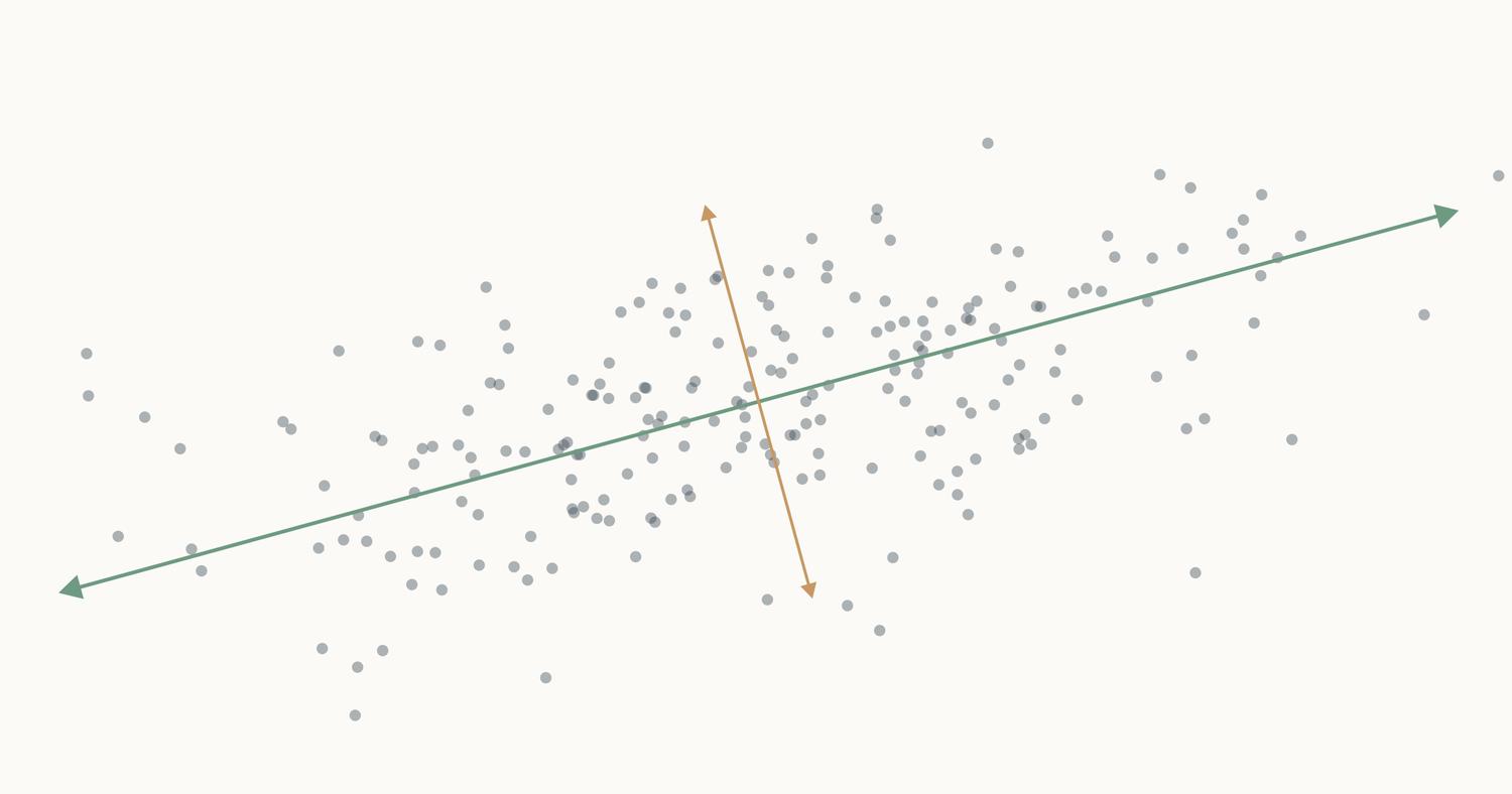
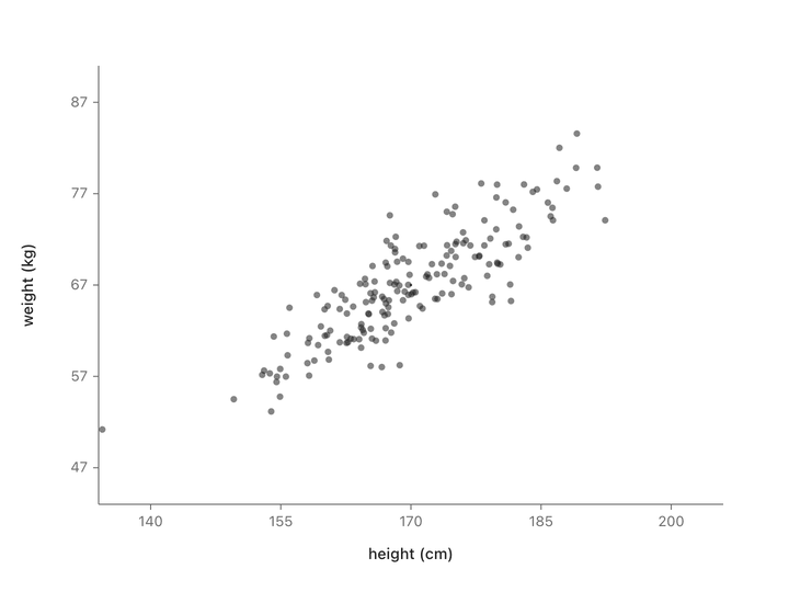
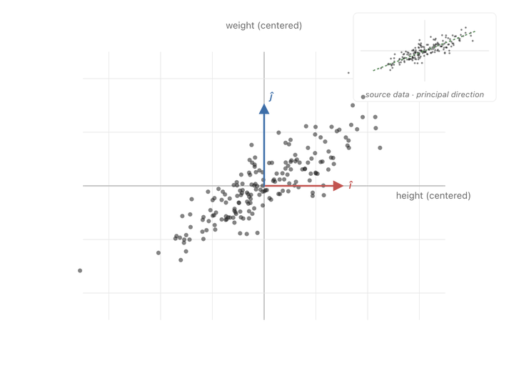
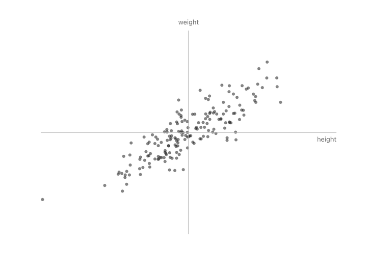
Let’s take people’s heights plotted against their weights. You don’t get a random splatter. Taller people tend to weigh more, so the points line up into a diagonal cloud.
Both columns vary here. There’s no single thing we can subtract to leave just the informative part. But if we change to new axes that match the shape of the cloud (one along the direction of maximum variation, one perpendicular to it) and rotate the plot so those new axes become our coordinate system, something interesting happens.
Nothing has been thrown away. Every person is still represented by two numbers. We’ve just re-described them in a coordinate system that matches how the data actually varies, instead of the arbitrary height/weight axes.
Now look at the second axis after the rotation. The variation along it is small. Almost everyone has nearly the same value there. That’s the “shared” part, same as the “37” in the temperature column. We can drop it and lose almost nothing depending on how much precision we need. If you compare variation along the original height/weight axes to the variation along the new axes, you can see that the second axis is much less informative.
Two columns down to one. This 2-feature dataset was really only carrying one independent thing (call it “body size”) with a small variation on top. PCA found that one thing automatically.
Doing this in math
The animation showed us what we want: find the direction the cloud varies the most, rotate to align with it, drop the leftover dimension. But if we want to do this on a dataset with ten columns or a hundred, we can’t draw it. We need to translate each step of that picture into an operation we can compute.
Start with the easy part. We can calculate “how much a column spreads” using variance.
$$\sigma^2(x) = \frac{1}{N} \sum_{i=1}^{N} (x_i - \bar{x})^2$$where $\bar{x}$ is the mean of the column.
If the data only had one column, we would be done. But look at height/weight again. If we compute variance on each column separately, we get two numbers (heights vary this much, weights vary this much). Neither number tells us that the interesting variation lives along a diagonal. Column-wise variance only knows about its own axis; it can’t see direction.
What we need is a way to say: tall people tend to be heavy, so the cloud slants up. That’s correlation.
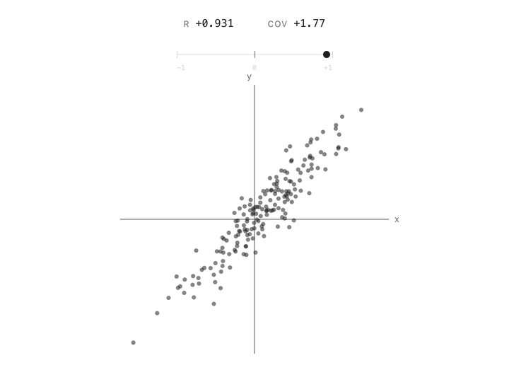
Correlation between two columns is a single number between $-1$ and $+1$. At $+1$, the points follow a line going up. At $-1$, they follow a line going down. At $0$, the cloud has no slope, knowing one column tells you nothing about the other. Height and weight are positively correlated. Altitude and air pressure are negatively correlated. Two unrelated measurements land near zero. In one number, correlation captures the shape of the relationship.
But correlation has a limitation. It doesn’t care how big the column’s variation is. Two columns measured in millimeters or kilometers with the same underlying linear relationship give the same correlation number. That’s useful if you’re comparing relationships across datasets, but it’s a problem for us. The whole point of PCA is to measure how much variance is present in each direction, and correlation throws that magnitude away.
What we actually want is the cousin of correlation i.e., covariance. Same idea as correlation but it keeps the raw magnitudes instead of normalizing them out.
Essentially:
$$\text{corr}(x, y) = \frac{\text{cov}(x, y)}{\sigma_x \, \sigma_y}$$Rearranged, $\text{cov}(x, y) = \text{corr}(x, y) \cdot \sigma_x \cdot \sigma_y$. So covariance is correlation scaled back up by how much each column actually varies. A single covariance number tells us both “do these move together?” and “how much?” in one value.
That’s exactly what PCA needs. The job is to rank directions by how much variance they have and keep the top ones. Covariance tells us both: the direction and the magnitude.
We need to calculate covariance across all the columns. For $k$ features, the covariance matrix is a $k \times k$ grid where entry $(i, j)$ is $\text{cov}(\text{feature}_i, \text{feature}_j)$. The diagonal entries are the per-column variances (since $\text{cov}(x, x) = \sigma^2(x)$). The other entries are the pairwise covariances. The matrix is symmetric because $\text{cov}(x, y) = \text{cov}(y, x)$.
That matrix is the full description of how our data varies. How each column varies with respect to the others.
But couldn’t we just drop the redundant columns directly? In the height/weight cloud, neither height nor weight is redundant on its own. Both vary a lot. The redundancy is between them, along the diagonal of the cloud. To see it, we have to switch axes.
Ok, now we have a matrix that tells us all the diagonal variances. But how to switch to a new coordinate system aligned with those? After we do that, we can drop the least variant features.
Matrices: viewports into the multiverse
So far the covariance matrix has been a matrix of numbers that describes the data. But we need to understand what matrices are and what happens when you multiply a set of points with a matrix: it’s a transformation. You feed it a bunch of points, and it hands them back in a new arrangement.
Think of it like putting a set of points through a lens. The lens can rotate, stretch, squeeze, or skew them or all of those at once. The underlying space doesn’t change; the layout you see does.
Let’s understand it from a very basic matrix transformation and what it does to some points.
For example, take this 2x2 matrix:
$$ A = \begin{pmatrix} a & c \\ c & b \end{pmatrix} $$Apply it to the point $(x, y)$:
$$ \begin{pmatrix} a & c \\ c & b \end{pmatrix} \begin{pmatrix} x \\ y \end{pmatrix} = \begin{pmatrix} a x + c y \\ c x + b y \end{pmatrix} $$The diagonal entries ($a$ and $b$) scale each axis on its own. The off-diagonal entry ($c$) mixes the two axes together.
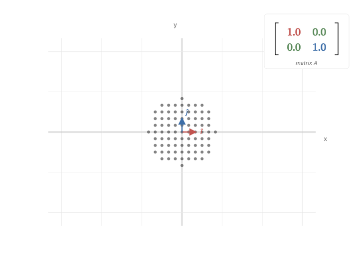
When $a$ or $b$ goes up, the cluster just stretches along that axis. But when $c$ goes up, $x$ and $y$ get mixed, and the cluster stretches along the diagonal direction $(1, 1)$.
If you look at the covariance matrix, it looks very similar to our diagonal scaling matrix i.e., high covariance entries are exactly in the place to expand points in the covariance direction. It pulls points hard in the directions where the data varies the most, and barely nudges them in directions where the data doesn’t vary.
You can see the effect point by point. A point sitting along the cloud’s diagonal the direction the data spreads in, gets pushed further along that same diagonal. A point sitting perpendicular to the cloud barely budges, or gets squished toward zero. Points in between get rotated toward the diagonal and stretched along it. Watching the whole scatter at once, the picture elongates along the principal slant and thins out the other way.
Ok, now we have another meaning to our covariance matrix, a transformation matrix that can push points to spread in the directions of covariance. What we need to do is make our axes from those directions and switch to them to represent our values. To find these axes, we need eigenvectors.
For deeper intuition on matrices as transformations, see 3Blue1Brown — Linear transformations and matrices.
Eigenvectors: directions the transformation can’t bend
Axes have a specific property. They’re independent. You can’t build one from another, i.e., as a combination of other axes.
So what should our new axes be? Look at how the covariance matrix acts on different vectors. Most vectors get bent off their original direction by the matrix. But there are special vectors that don’t. The matrix only stretches them along the line they were already on, no rotation.
If we pick those direction-keeping vectors as our axes, the matrix’s pull doesn’t mix any of them into another. Each axis stays on its own line, separate from the others. That’s what makes them independent. That’s what makes them good axes.
These direction-keeping vectors are the eigenvectors of the matrix. Every symmetric matrix has its own set. For our covariance matrix, those eigenvectors are exactly the lines we drew in the very first animation, the directions of variance in our data.
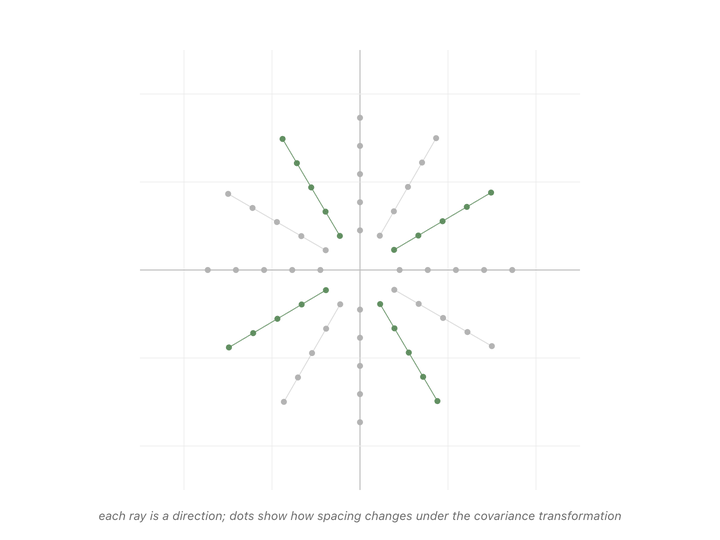
Every direction in the animation’s fan gets pulled somewhere when we apply the matrix. Most of them rotate, the dots along those rays drift off their starting line. But a couple of rays’ dots stay on the line they started on. The only thing that changes for those special directions is the spacing between dots. Either stretched or shrunk. Those are the eigenvectors of the covariance matrix, and the scale factor applied to their spacing (how much they got stretched or shrunk) is the eigenvalue.1
Formally: a vector $v$ is an eigenvector of a matrix $A$ with eigenvalue $\lambda$ when
$$A v = \lambda v$$All that equation says is: applying the matrix to $v$ gives the same result as just multiplying $v$ by a scalar. The matrix doesn’t rotate $v$; it only scales it.
The eigenvectors of the covariance matrix point along the directions in which the data varies, and the eigenvalues are exactly how much variance lives along each direction. The largest-eigenvalue eigenvector is the direction of maximum variance, and that’s the principal component. The next-largest is the direction of maximum variance orthogonal to it.2 And so on.
Ranking eigenvectors by their eigenvalues gives us exactly the coordinate system we built by hand in the very first animation. The “drop the thin leftover dimension” move is literally: drop the eigenvectors with the smallest eigenvalues, because those are the directions where the data barely varied.
For deeper intuition on eigenvectors and eigenvalues, see 3Blue1Brown — Eigenvectors and eigenvalues.
Putting it all together
So take the first $k$ eigenvectors (the principal components) and use them as a transformation matrix on your data. Let $V_k$ be the matrix with those first $k$ eigenvectors as its columns:
$$ X_k = V_k \cdot X $$That’s the whole algorithm3:
$$ V, \lambda = \text{eigen}(\text{cov}(X)) $$$$ X_k = V_k \cdot X $$where:
- $X$ is the original data
- $V$ is the matrix of eigenvectors, with each column being one eigenvector
- $\lambda$ is the vector of eigenvalues, one per eigenvector
- $V_k$ is $V$ with only its first $k$ columns (the eigenvectors with the largest eigenvalues)
The covariance matrix’s eigenvalues are never negative because variance can’t be negative. So in the eigenvector animation, the eigenvectors only stretch or compress, they never flip. For a general matrix, a negative eigenvalue would flip the vector across the origin, but we can’t see that here. ↩︎
Why does PCA create orthogonal axes? Each new component is defined as the direction of maximum variance among what’s left after the previous ones are accounted for; in 2D that remaining space is literally the perpendicular line, so PC2 has no choice. In higher dimensions the same thing keeps happening. Mathematically, PCA’s components are eigenvectors of the covariance matrix, which is symmetric, and eigenvectors of symmetric matrices are always mutually orthogonal. Other dimensionality-reduction methods (ICA, autoencoders) don’t have this and can find non-orthogonal directions. ↩︎
SVD (Singular Value Decomposition) is a more general decomposition method that works on any matrix. For PCA’s covariance matrix, it functions the same as eigendecomposition and gives the same principal components. So most PCA implementations use SVD instead of eigendecomposition. ↩︎